POINTS
CLASS INTERVALS
94
93.50 - 94.49
95
94.50 - 95.49
96
95.50 - 96.49
97
96.50 - 97.49
98
97.50 - 98.49
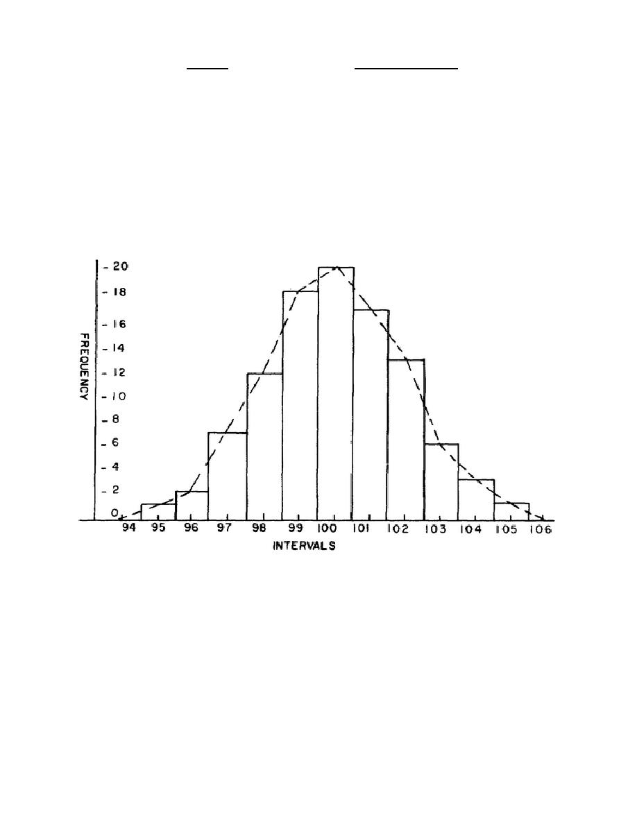
(6) The FREQUENCY is merely a count of the TALLY. The frequency is
now graphed against the class interval (or its midpoint) in figure 5.
Figure 5.
Graph of data
(7) If the graph consists only of the vertical rectangles, it would
be called a HISTOGRAM. However, if the graph were made by connecting the
midpoints of the tops of the intervals (as shown by the dotted line), it
would be a FREQUENCY POLYGON. Both methods show the way in which the errors
are distributed.
c. Range.
Range is simply the difference between the minimum and
maximum items.
In certain conditions, a knowledge of the range of a
distribution is adequate, but it must be remembered that the range alone
157


 Previous Page
